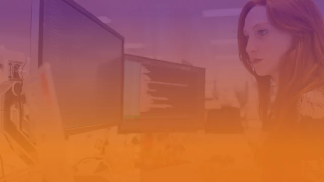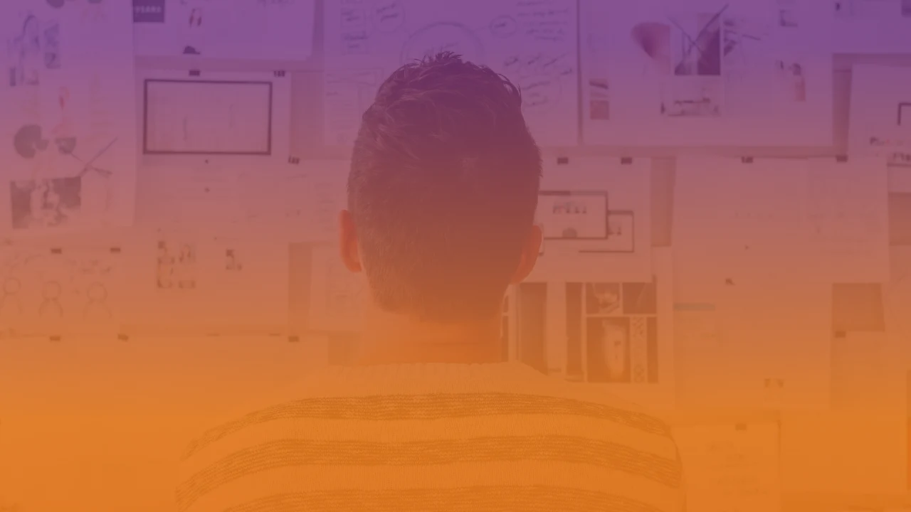
At Directio, we solve complex problems with clean lines of simple, elegant code – all while having fun in the process! As we grow and evolve, we’ve decided to update our visual identity to better reflect our mission. Our software engineers wanted to inspire a team of talented artists to express the best principles of effective coding through the language of graphic design. Have they been successful? Join us and let’s take a closer look at the thought process behind Directio’s new visual identity and how it ties into the company’s approach to IT consulting and software development!
Directio is first and foremost a problem-solving company. Our new visual identity reflects this ethos with its clean lines and simple elegance. Turns out the language of coding and graphic design are surprisingly similar! Thanks to the insights provided by our coders, the artists responsible for our new visual identity were able to harness this connection to create a logo that is both functional and good-looking. For instance, the emblem in the new logo is reminiscent of angle brackets used in coding, symbolizing… well, more on that later!
Polish Roots, Global Reach, Multicultural Ethos
Since our beginnings in 1997, we’ve gone through a lot of changes as a company, workplace, and as a team of industry enthusiasts. Everything started in Warsaw with a crew of Polish youngsters and a generous touch of American-made entrepreneurship. Now, with branches and team members spread all over the world, we’ve become a truly diverse bunch and enjoy an environment enriched by a kaleidoscope of experiences. Along the way, we’ve learned to adapt to the needs of different clients and the demands of various markets and evolved our approach to building and maintaining dev teams. But amidst all this change, we’ve never lost sight of where we came from. By choosing a wordmark that visually blends the “pl” part with the rest of our brand name we show that our local heritage has become an integral part of our global present and future.
Tackling Complexity with Simplicity
We created our new emblem by transforming the old one, because building on past experience and benefiting from tested solutions are some of the best principles in software development and IT consulting. The sign is inspired by angle brackets, a symbol that is commonly used in coding. This design choice highlights our commitment to solving complex problems in the digital environment. It’s a nod to Directio’s mission of using programming languages to create practical solutions that help our clients’ businesses thrive.
Playful Approach to Software Development
Our new emblem is similar not only angle brackets, but also to the good old play sign, and it’s no coincidence. Life is a puzzle – all about solving problems, and software development is no exception. For that, nothing is better than a gamer’s attitude! Our new logo represents just that, the idea of merging work and play, of tackling difficulties with a joyful and creative mindset, of gamifying the process of crafting tailor-made solutions to our clients’ specific needs.
We’re thrilled with how our new visual identity captures the spirit of Directio. We hope our clients and partners will appreciate the new look as much as we do. The best thing about it is that it’s more than just a polished logo. It’s a reflection of who the company is, what it stands for, and how it approaches IT consulting and software development. It’s an intentional and powerful representation of our values, mission, and commitment to excellence.
Angelo Pressello, CEO